Why the State Department is adopting responsive design


State officials are redesigning and consolidating the websites for its foreign missions to streamline content management and better accommodate mobile users.
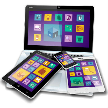
The State Department is in the midst of a project to shift its 450 websites for overseas missions -- which host country information, visa applications and more -- to WordPress. The new sites' responsive design scales content to the screen size of a user's device.
"It's going to dramatically reduce our footprint to help us better manage our systems, and it's going to be much easier for our content managers in the field to have one CMS platform for updating their content and their messaging," project manager Becca Jenkins told the Responsive Web Design podcast.
The sites for New Zealand, South Africa, Samoa and the Czech Republic have already transitioned to the new platform. Individual embassies and consulates currently have separate mobile and desktop sites, and some countries have multiple sites. The goal is to redesign and consolidate the 450 sites into 195 by the end of the year.
Many factors affect the transition, including network speeds in other countries and the prioritization of the department's most-used services.
"Early on in the process, we were looking at some of these widely available commercial responsive themes, and what we decided...is that they were just a little heavier than what we wanted," she said. "That's why we decided to go in the direction of a lightweight kind of starter theme, to just build from there so we weren't overdeveloping on our platform, to keep it simple."
According to State's web metrics, about 30 percent of the traffic to such sites comes from mobile phones and 7 percent from tablets. Although some of the content was designed to be easily consumed and shared, users typically perform the more crucial, popular functions -- such as visa applications and passport renewals -- on a desktop PC.
"The desktop is still very critical for us," Jenkins said.