The Problem With America's New National Broadband Map
National Broadband Map FCC


This long-awaited map looks like a precise picture of connectivity in America. Many people will find it doesn’t match what’s happening in their homes.
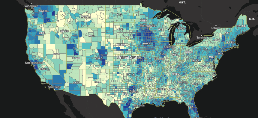
Before last week, the official U.S. map of broadband access had accumulated a fair amount of dust. On February 23, though, the Federal Communications Commission’s cartography of connectivity got a long-awaited upgrade. But while the new broadband map is easier to click around, it still isn’t a reliable tool to gauge what internet options are available to homes or communities around the country.
Just ask one of the FCC’s commissioners what’s wrong with it.
“I looked up my house and can tell you with good authority it lists service that is not available at my location,” Democratic commissioner Jessica Rosenworcel wrote in a dissenting statement. She invited people to e-mail error reports to an inbox she had set up: broadbandfail@fcc.gov.
Christian Moe, an automotive journalist living outside of Knoxville, Tennessee, struggled to get broadband at a home that was advertised as having it. He offered a similar critique in an e-mail.
“The map at my section of the world is hilarious,” he wrote. The map listed AT&T’s top download speed at his address as 75 megabits per second—about six times faster than the best service he could actually get, 12 Mbps.
The map’s biggest downfall lurks behind its search-by-address function, which suggests a precision that its underlying data usually can’t deliver. The FCC data doesn’t get more granular than census blocks—statistical areas that can span a city block or several counties. Within census blocks, internet access can vary quite a bit. Just because your closest neighbors have broadband doesn’t guarantee that you’ll have any.
An FCC spokesman said the agency is considering asking for more detailed coverage data from providers, but warned that this could be “burdensome.”
The map also doesn’t cite prices. The FCC doesn’t collect that information, much less factor in complications like the discounts that cable firms offer for bundling TV, phone, and internet service.
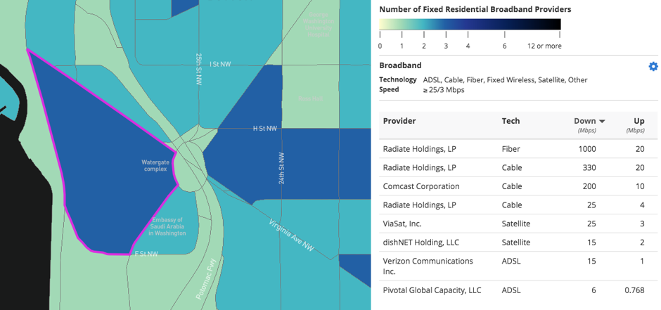
To make things more confusing, the broadband map identifies internet providers by their holding companies, not necessarily the names you’d recognize on a bill. At CityLab’s D.C. office, for example, the map lists one provider as “Radiate Holdings, L.P.” You’ll have to consult a separate FCC table to find out that this firm owns cable provider RCN.
Finally, the newest internet providers don’t appear on the map at all. For example, checking a Cambridge, Massachusetts, ZIP code doesn’t list Starry, a promising residential-wireless startup.
The map’s raw material is a document called Form 477. The FCC requires internet providers to submit the forms twice a year, reporting the top advertised download and upload speeds across each census block in which they sell access.
That filing schedule explains Starry’s absence: Spokeswoman Virginia Lam said the Boston firm was still in a closed beta test at the end of 2016, meaning it didn’t have to file the forms that fed the new broadband map. Future updates should include that firm.
The private sector has only filled in some of the information gaps. A site called BroadbandNow takes the FCC’s data, corrects errors that it finds, and adds pricing data that it gleans from various sources. (Scraping rates off providers’ sites with automated software would be faster, but also lawsuit bait). BroadbandNow collects referral fees from some providers.
“We have a data team that works on this—we’re in there every day, manually reviewing ISP sites, testing addresses, on the phone with reps, coordinating with marketing and technical teams at various ISPs,” e-mailed marketing head Jameson Zimmer.
But BroadbandNow only lets you search by ZIP code (Zimmer said they’re working to add address-level queries) and remains subject to the limits of the underlying FCC data (it doesn’t list Starry either).
BroadbandNow’s price data can also miss smaller, more interesting options. In the Sonoma County town of Sebastopol, for instance, it omits rates for the gigabit fiber service that the Santa Rosa, California, firm Sonic has offered since 2011.
“I’ve seen their site, but they’ve never reached out to me for any pricing,” Sonic CEO Dane Jasper wrote. “It’s certainly possible they’ve tried to reach someone else here via support or sales e-mail addresses and that never got routed to my attention, though.”
It’s also easy to find private-sector maps of mobile broadband coverage—see, for instance, the data produced by firms like RootMetrics. But while a car stuffed with instrumentation can drive around and measure bandwidth waiting in the air, there’s no similar way to find out how much bandwidth reaches homes by wires.
Meanwhile, most local broadband markets don’t have a lot of competition, consisting of just a phone company and a cable company. Dave Burstein, a longtime telecom consultant and editor of Fast Net News, said those conditions leave fewer reasons for incumbent providers to reward ISP-finder sites with commissions. (The new broadband-map site, built for the FCC by Mapbox, makes it easy to visualize this lack of competition across counties, congressional districts, and states.)
So if you want to know all the broadband options available at your home, you’ll have to do things the hard way: Consult both the FCC and BroadbandNow, then plug your address into the site of every provider listed as offering respectable speeds.
If that seems aggravating after the third time, take a moment to pat yourself on the back: Your home has more broadband options than most American abodes.