Facebook Is Making a Map of Everyone in the World


And it's using a brand new AI technique and a whole lot of computing power to do it.
Americans inhabit an intricately mapped world. Type “Burger King” into an online box, and Google will cough up a dozen nearby options, each keyed to a precise latitude and longitude.
But throughout much of the world, local knowledge stays local. While countries might conduct censuses, the data doesn’t go much deeper than the county or province level.
Take population data, for instance: More than 7.4 billion humans sprawl across this planet of ours. They live in dense urban centers, in small towns linked by farms, and alone on the outskirts of jungles. But no one’s sure where, exactly, many of them live.
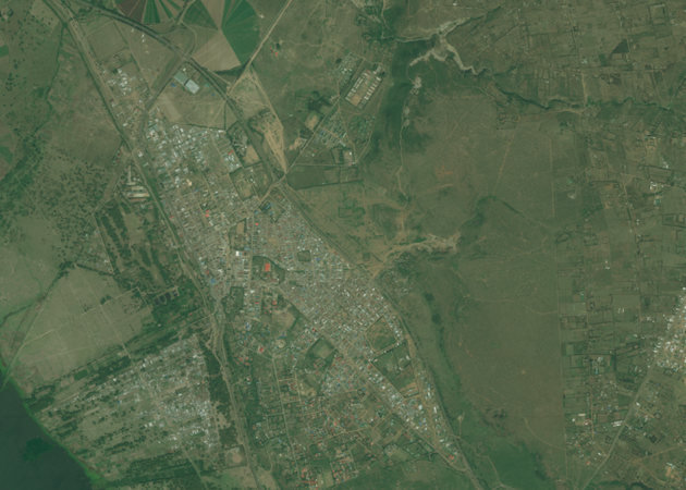
Now, Facebook says it has mapped almost 2 billion people better than any previous project. The company’s Connectivity Labs announced this week that it created new, high-resolution population-distribution maps of 20 countries, most of which are developing. It won’t release most of the maps until later this year, but if they’re accurate, they will be the best-quality population maps ever made for most of those places.
The maps will be notable for another reason, too: If they’re accurate, they’ll signal the arrival of a new, AI-aided age of cartography.
In the rich world, reliable population information is taken for granted. (There are even nerd jokes about the need to remove population density from U.S. geographical data.)
But elsewhere, population-distribution maps have dozens of applications in different fields. Urban planners need to estimate city density so they can place and improve roads. Epidemiologists and public-health workers use them to track outbreaks or analyze access to health care. And after a disaster, population maps can be used (along with crisis mapping) to prioritize where emergency aid gets sent.
Facebook has a bottom-line interest in the data. Its future corporate growth depends on Internet access expanding to the roughly 4 billion humans who can’t yet log on, so it’s explicitly interested in the maps for infrastructural reasons. It wants to know how a certain population might gain Internet access most efficiently: Should they run a fiber-optic line, or would the task best be accomplished with drones, satellites, or high-altitude balloons?
That’s part of why Facebook chose the countries it did: 20 nations where the web still does not reach some rural populations. They include Nigeria, Kenya, Uganda, Turkey, Ukraine, Uzbekistan—and India, where the company’s Free Basics product was just rebuffed. Free Basics and Connectivity Labs are both part of Internet.org, an international (and often for-profit) corporate initiative to expand the reach of the web and, with it, Facebook’s services.
But in all of those countries, how did Facebook make better population maps than anyone else, including local governments? It’s not like they paid vans to drive around the landscape like Google did. The answer lies in Facebook’s access to incredible computing power.
Here’s how the maps got made: Facebook’s Connectivity Labs first took the best-available world population information, a dataset from Columbia University called Gridded Population of the World. This is an agglomerated set of local census data, normalized to the same year. It’s the best population map available globally, but it’s fairly low resolution: The grid squares can vary from “a few square kilometers in urban areas to tens of thousands of square kilometers in the rural areas of interest,” according to Facebook.
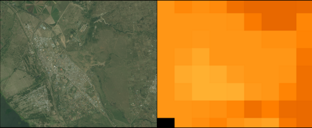
Then, it bought millions of kilometers of high-resolution satellite imagery from DigitalGlobe, the company that operates most of the private, high-resolution Earth-observing satellites now in space. When you look at your house in Google Maps, you’re usually (but not always) looking though one of DigitalGlobe’s four orbiting lenses.
Most DigitalGlobe imagery is “submetric”; that is, instead of a grid square being hundreds of kilometers to a side, it’s 50 centimeters. Facebook developers taught their neural-net algorithms to recognize what a building looked like from above in this data. Then, they turned the programs loose. The software estimated urban density by the number of buildings it could see, and extrapolated the best-available population data onto the settlements.
“They made a fairly basic assumption that when they see a building, there must be people who live there,” said Robert Chen, an Earth scientist at Columbia University. Chen directs the team that made Gridded Population of the World, the base dataset used by Facebook.
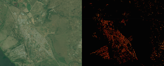
If this technique sounds methodologically simple, it’s because … it is. It just requires access to neural-learning software and a small oil seam’s worth of computing power. Facebook estimates that it analyzed 21.6 million square kilometers of the 20 countries.
“For this we processed 14.6 billion images with our neural network; this is more than ten times as much as all the images analyzed by Facebook on a daily basis,” it says.
Chen cautioned that Facebook’s data couldn’t be used to compute how urban density (or a similar marker) relates to local population, because then the research would eat its own methodological tail. But “you can see how that can be valuable in a lot of different contexts,” he said.
Facebook has not released final versions of the maps yet. It says final versions are coming this summer. Before that release, Chen’s team will adjudicate its accuracy. While Facebook’s early results are promising, he said it’s still not known how generally precise or widely applicable its technique will be.
“We’ve only seen pieces of it,” he said. But if the technique seems to hold, Chen said Facebook would then add six more countries.
And if the data proves useful, Connectivity Labs’s success will signal a victory on something that has long stymied developers working with satellite data: the algorithmic interpretation of imagery.
In the next half decade, a fleet of Silicon Valley-funded satellite companies will release many more terabytes of imagery to the public than was previously available to civilians. These photos will be cheaper than ever before, and they’ll be more recent: Thanks to cheaper rockets and advances in small satellite-building, some companies are promising “revisit rates” of six or seven times per week.
This new data won’t be valuable unless companies—especially financial companies—get good at deciphering it without human labor. Already, startups like Skybox (owned by Alphabet) and Descartes Labs say they’ve made advances in pulling information out of pictures without a person sitting at the table. If Facebook’s map works, it’ll be one more sign that such a goal is feasible.
NEXT STORY: USAJobs update offers tracking to job applicants