Your real-time cyberattack map
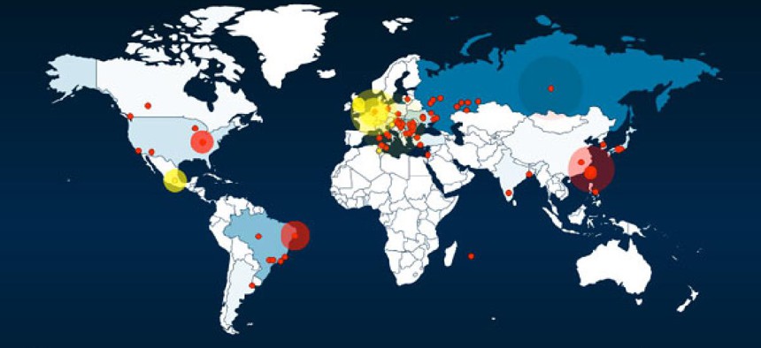
The map, as of Monday morning. Honeynet Project


Honeynet Project tracks attacks worldwide in a constantly-updated animation.
I have no idea how reliable the info shown here is, but it certainly is interesting. Especially to me, as I climb onto a plane bound for southern China via Japan. It's an animated real-time visualization of (it says) attempted cyber-attacks. Click below for a more detailed view or on the link above to see the real-time map.
More on the background of the Honeynet Project and this map here. I like the tone of its explanation:
What kind of attacks are these? Are they "targeted"?
The data that is currently shown on the HoneyMap is mostly not "targeted" in the sense that a human attacker with a specific goal is monitored. Mostly, we see automated scans and attacks with the current set of sensors and they originate from infected end-user computers or hijacked server systems. This also means that an "attack" on the HoneyMap is not necessarily conducted by a single malicious person but rather by a computer worm or other forms of malicious programs.
Is the data representative?
Kind of. Historically, this kind of visualization would be skewed by the sensor location but with newer attack code (e.g., Conficker) this is not true anymore as the attack target selection is randomized.
I expect to be mainly offline for the next week, which means that the promised Jobim wrap-up, among other things, will probably need to wait. Enjoy this week's debate.
NEXT STORY: Air Force seeks to redefine cyberspace