New Font Automatically Censors ‘Spook Words’ Monitored by the NSA
Emil Kozole/Project Seen


Do you dare install this font on your computer?
Do you dare install this font on your computer?
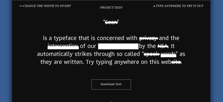
The new font called Seen automatically crosses out words flagged in the list of sensitive “spook words” monitored by the National Security Agency (NSA). According to research by its creator, the NSA monitors about 30,000 trigger words and the UK spy agency Government Communications Headquarters (GCHQ) watches about 40,000. Among them are the words artichoke, Joe, Harvard, face, Kenya, beef, clone, bank, and communication.
The interactive project demonstrates how our everyday tweets, posts and comments are monitored by government security agencies and offers an elegant expression of the intersection of words, typography and personal privacy.

Seen is the work of graphic designer Emil Kozole, who created it as part of his masters degree program at Central Saint Martins in London. Kozole explains that even the shape of the letterforms in his sans serif typeface references the kind of infringement that his project seeks to surface. “The general idea of Seen is that it infiltrates into a category of system fonts such as Arial and Verdana,” he tells Quartz.
The font comes in three weights—Strikethrough, Underline and Blackout—presumably corresponding to the perceived level of threat a word connotes. The font, which is free to download, was created in OpenType (OTP) format and works in both Macintosh and Windows platforms.

Kozole’s auto-redacting font, intended to be an art project, can’t actually protect your missives from surveilling eyes but it hopes to rekindle the debate about the seemingly lost cause of online privacy.
“The list [of pre-loaded trigger words] is based on a publicly available list of words released in 2012 by the Department of Homeland Security,” says Kozole. “Since then, the list has probably changed many times and no one except people at these agencies have access to it.”
Ultimately, Kozole aspires to demonstrate the growing chasm and mistrust between governments and their constituencies wrought by increasing levels of surveillance.
“Perhaps the typeface can spark new debates in an undefined field of language versus data and gesture towards new evasive techniques that can protect people’s privacy,” reflects Kozole.

“Electronic surveillance nerd espionage rockets;” Boobytraps thermite import high security spookwords;” “Flame mixmaster eavesdropping to sport package.” The Slovenian-born designer has been thinking about privacy and what he calls “dataveillance” throughout his studies. Last year, he created “NSA Writer,” a bot that tweets nonsensical phrases drawing from that list of trigger words. The lines almost sound like verses from a wayward limerick: “Electronic surveillance nerd espionage rockets;” Boobytraps thermite import high security spookwords;” “Flame mixmaster eavesdropping to sport package.”
Kozole was influenced by George Orwell’s 1984, a dystopian story about government’s perpetual surveillance embodied by the Big Brothercharacter. “He wrote about a new form of language called “Newspeak” that will be adopted to prevent radical thinking,” explained Kozole. Quoting Orwell, he writes: “the Newspeak vocabulary was tiny, and new ways of reducing it were constantly being devised. Newspeak, indeed, differed from most all other languages in that its vocabulary grew smaller instead of larger every year. Each reduction was a gain, since the smaller the area of choice, the smaller the temptation to take thought.”
So has Kozole been contacted by the NSA? “Not yet. Hopefully they will understand it, but I will probably find that out next time I am at the US border :),” he wrote in an email to Quartz.
If you’re not ready to risk installing the font, you can take it for a test drive on Project Seen’s website.