Visualizing the State of Global Internet Connectivity
chombosan/Shutterstock


Two maps illustrate disparities in access across the world.
Internet access continues to expand across the globe. According to the second State of Connectivity report compiled by researchers at the Facebook-led Internet.org initiative and released in February, the number of people using the internet jumped from 2.9 billion in 2014 to 3.2 billion in 2015, placing the percentage of connected individuals at 43 percent worldwide.
But this top-line understanding of progress masks wide discrepancies between the more-developed and still-developing worlds. At the end of 2015, 82 percent of the population in the developed world used the internet; in the developing world, that number is much lower—just 35 percent.
It’s no longer sufficient, however, to talk about internet access in terms of have and have-not. Eric Tyler, a research fellow specializing in technology and economic development at New America, says in order to talk about the stratification of global connectivity, we have “get into the weeds.” Examining differences in the availability of mobile networks, Tyler says, is a good place to start.
According to data from the International Telecommunications Union, the United Nations’ specialized agency on technology, 95 percent of the world’s population lives in areas covered by at least a basic 2G mobile cellular network coverage, but that doesn’t do much to address the internet access gap.
“People often gloss over the difference in experience between a 2G network and a 3G or 4G broadband connection,” Tyler says. Downloading a basic app on a 2G network, he adds, can take as long as 30 minutes.
The map below, from Internet.org’s State of Connectivity report, details where 2G, 3G, and high-speed 4G networks are used to connect to the Facebook app:
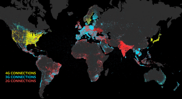
For the most part, developing countries make the greatest use of the 2G network; ITU estimates 70 percent of people in rural areas don’t have access to mobile broadband networks. Recognizing the importance of reliable internet connectivity to sustainable growth, economic inclusivity, education and public health, ITU set out the Connect 2020 Agenda in November 2014, calling for 90 percent of the world’s rural population to be covered by broadband in the next four years.
It’s an ambitious plan, but another researcher points out mobile devices only tell half of the story. John Matherly, the founder of the search engine Shodan, says beyond an individual person’s internet connectivity, looking at the density of internet-enabled devices points to a particular country’s level of modernization.
In 2014, and again just this month, Matherly performed a simple test to visualize every internet-connected device on the planet. He sent out a ping request to every IP address in the world, and catalogued all of the responses he received—a process Gizmodo describes as “the internet’s version of ‘hey, are you there?’”
In the 2016 map, below, clusters of red indicate where the highest densities of internet-connected devices are located; blue areas denote less density.
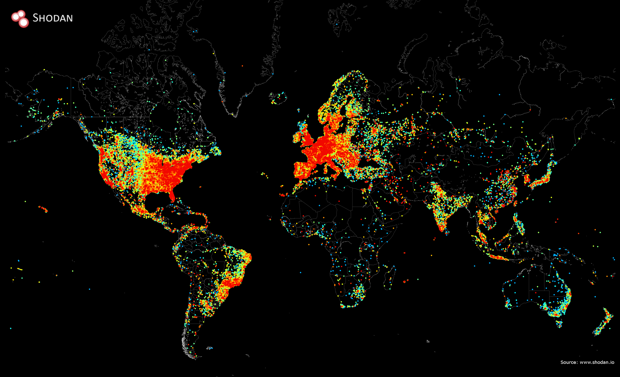
Structurally, the clustering of devices in Matherly’s map is not dissimilar from the distribution of mobile broadband networks. This makes sense, Matherly says, even though the majority of the devices tracked in his map are not personal, but infrastructural: buildings, smart lighting systems and other internet-controlled systems.
The “smart city” model encompasses everything from urban design to solar energy; Matherly says it’s not surprising clusters of red appear so prominently in Europe, where cities like Amsterdam have been advocating for these cutting-edge technologies for years.
Over the course of his two different mapping processes, Matherly has seen the density of internet-connected devices in the developing world hold fairly steady; in developing nations like Antigua, he says, “connectivity has increased 100 fold.”
With ITU pushing for more individual network access and technology continuing to infiltrate infrastructure, the two maps will likely show very different color distributions over the next several years—and much less un-networked dark space.
NEXT STORY: NTIA wants to know IoT address needs