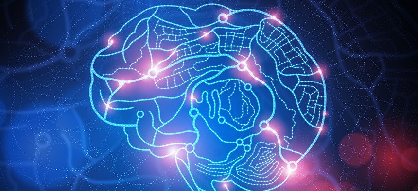
The Many Ways to Map the Brain
solarseven/Shutterstock.com


It takes both science and art to make sense of the organ’s complexities.
Brain mapping has come a long way since the days of Korbinian Brodmann. The German neurologist was cutting edge for the early 1900s, using newly invented chemical stains that made it possible to see individual neurons through a microscope. After years of peering at thin slices of brain tissue, Brodmann drew a map to show what he’d discovered: Different regions of the cerebral cortex had different mixes of cells. This might be an important clue, he thought, to each region’s function.
Brodmann would be blown away by two new portraits of the brain released in the last few weeks. One is an ultra high-tech map that captures thousands of neurons firing in the brains of mice in response to what the animals see. The other is a gigantic work of art. Each is amazing in its own way, and the difference between them illustrates a new divide in the way we map our world.
The high-tech map comes from the Allen Institute for Brain Science, in Seattle. The institute, launched by Microsoft co-founder Paul Allen in 2003, takes a big-data approach to studying the brain, aiming to map it in as much nitty-gritty detail as possible. Their past efforts include microscopic circuit diagrams showing how neurons connect with one another and splotchy 3-D maps that show which genes are turned on where in the brains of mice and humans.
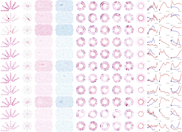
The new map is more dynamic. It charts the electrical activity of more than 18,000 neurons in the visual cortex, an area of the brain crucial for visual processing, as mice view stimuli ranging from simple, black-and-white bars to movie clips. The institute’s researchers see it as a step toward understanding how thousands of neurons, each tuned for different features, act together to make sense of an animal’s visual world.
This map represents a remarkable technical feat, and a step in the evolution of brain mapping. For the century before Broadmann and the century after, people have tried to assign specific functions to specific brain areas in an attempt to figure out how the whole thing works. But the tools—and the overall approach—have gotten more sophisticated.
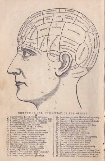
There’s an interesting parallel here with the much longer history of cartography. In both neuroscience and cartography, some of the earliest maps were sketchy affairs. Phrenology, a scheme cooked up at the end of the 18th century, was one of the first attempts to map which parts of the brain did what.
Unfortunately, it was more guesswork than science. “Combativeness” commonly lurks just behind the ear and “Parental love” resides at the back of the head, the region we now know as primary visual cortex.
Despite their lack of actual knowledge, phrenologists left no blank spots on their charts. Early mapmakers, too, sometimes seemed either over-confident in their knowledge or reluctant to concede their ignorance, says Chet Van Duzer, a historian of cartography.
They might label the vast southern continent of Antarctica terra incognita and then proceed to decorate this unknown land with mountain ranges and animals. This type of cartographic license even prompted a quip from Jonathan Swift:
So Geographers in Afric-maps
With Savage-Pictures fill their Gaps;
And o'er uninhabitable Downs
Place Elephants for want of Towns.
During the Age of Discovery, cartography improved dramatically, as more maps were based on direct observation and surveys with scientific instruments. Similarly, as the 19th century progressed, phrenology died off and neurologists and anatomists like Brodmann began making careful sketches of the wrinkles of the brain’s surface, and squinting through microscopes to characterize the types of cells that resided therein.
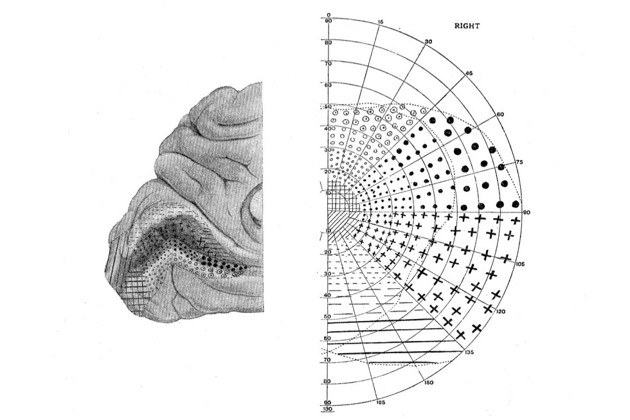
Physicians noticed that damage to certain parts of the brain affected specific functions like speech or memory, and they started making functional maps of the brain that had a solid basis in reality. The British neurologist Gordon Holmes, for example, discovered that the primary visual cortex contains an orderly representation of what the eyes see by studying the blind spots of World War I soldiers who’d suffered injuries to the back of the head.
Today, the bleeding edge maps of both brain and terrain have gotten incredibly complex, thanks to advances in both the sensors that collect the data and computers’ ability to store it. They are layered with information, and increasingly they can update themselves in real time, or close to it.
One example is the type of maps that Google and other companies are building to guide self-driving cars. These maps are packed with data on things like curb heights and lane restrictions and updated constantly with information on traffic flow and potential obstacles in the road ahead.
The new brain map from the Allen Institute is another example, as are their previous maps of brain anatomy and gene expression. The industrial-style neuroscience that created these maps has only become possible in recent years with progress in robotics, genetics, and optical imaging.
Scientists will need all these layers of information to understand how the brain performs the computations necessary for perception, or behavior, or consciousness, according to Christoph Koch, the Allen Institute’s president and chief scientific officer.
“It’s just not good enough to only understand the wiring,” he says.
Now the question is, how much data will be good enough—and who’s going to make sense of it all. The institute employs 25 people, mostly physicists, who are building computer models they hope will produce the kinds of insights Koch is seeking. They’re sharing their data freely with other researchers, too.
* * *
A very different portrait of the brain was created recently by Greg Dunn and Brian Edwards, artists with Ph.D.s in neuroscience and applied physics, respectively. It’s an 8-foot-by-12-foot art installation at the Franklin Institute in Philadelphia that depicts a slice through the human brain. The installation, which opened last month, is almost certainly the most complex piece of brain art anyone has ever made.
Dunn, the neuroscientist, studied photomicrographs of neurons and scoured the research literature for information about the connections among brain regions. The final piece depicts a dense tangle of more than 500,000 individual neurons, different features of which appear and disappear as visitors walk around it because the work is etched in polymer and coated with gold leaf in such a way that it reflects light differently from different angles. The piece can be animated by pulses from an L.E.D. light mounted above it in a way that mimics how information—in the form of electric impulses—might actually flow through this part of the brain.
They did all this, Dunn says, to give people a sense of wonder.
“I wanted this to be something people could stand in front of and just be like, ‘Holy shit, nature is so awesome,’” he says. “It’s what we all have in common with each other.”
Dunn thinks of his work as a map, but not the hyperaccurate kind the Allen Institute is striving for. A half-million neurons is but a small fraction of the number that would actually be in a slice of the human brain, and the neurons in the artwork are several times larger than they’d actually be at that scale.
Dunn didn’t trace them while looking through a microscope; he created them by blowing on drops of ink, a method he stumbled on that recreates the natural branching shape of neurons. He then used a computer to copy and tweak the cells to simulate the random variations found in nature.
Dunn and Edward’s work is rooted in science, but it’s artfully crafted to avoid being overwhelming. In this sense it reminds me of the best examples from the second stage of cartography, when maps became more based on direct observation but hadn’t lost their human touch.
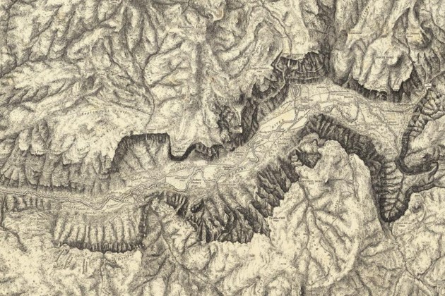
People still make this type of map today; they’re the ones you see in a National Park brochure, a road atlas, or the pages of a magazine. Like Greg Dunn’s art, they leave out some details and even take certain liberties in the service of clarity and aesthetics—omitting labels for small towns to avoid clutter, for example, and exaggerating the vertical scale to show the topography of mountains. I think of them as maps for humans.
I think of the latest high-tech maps—like Google’s maps for automated cars and the new brain map from the Allen Institute—as maps for machines. They’re so packed with information that they’re nearly impossible to comprehend just by looking. Only computers can really work with them.
Maps for machines will no doubt play a role in our future. These maps will (fingers crossed!) keep our robot cars on the roads, our planes in the sky, and help us finally understand our own brains. But we’ll always need maps for humans, too. It’s these maps that inspire us to take a trip in the first place, or at least wonder for a moment what’s over there.