How a Creepy Logo Doomed DARPA’s Surveillance Program

yurchello108/Shutterstock.com


Some of the military-technology agency’s images are disconcerting. Others are actually kind of cute.
In February 2002, shortly after the terrorist attacks of 9/11, The New York Times published a story reporting that John Poindexter, the former national-security adviser to Ronald Reagan, had a new role: the head of the newly created Information Awareness Office, a subset of the Defense Advanced Research Projects Agency.
The purpose of the office, the story read, was to “focus on what the agency refers to as ‘asymmetric threats,’ or nonconventional military targets like potential terrorist organizations.” In practice, this meant monitoring civilian digital transactions—or, as DARPA called it, “Total Information Awareness.”
By the end of that year, the program was the subject of a very public controversy, with privacy and civil-liberties advocates decrying its reach into citizens’ lives.
“The supersnoop’s dream: a ‘Total Information Awareness’ about every U.S. citizen,” the New York Times columnist William Safire wrote that November. “This is not some far-out Orwellian scenario. It is what will happen to your personal freedom in the next few weeks if John Poindexter gets the unprecedented power he seeks.”
The image chosen to represent the project wasn’t the sole source of the outcry—but it certainly didn’t help calm things down, either.

“The logo of the Total Information Project,” Annie Jacobsen wrote in her book The Pentagon’s Brain: An Uncensored History of DARPA, “became the focus of much ire.” This was something of an understatement: The logo, which depicted the Eye of Providence turning its gaze on the globe, was a public-relations nightmare, fueling both criticism and conspiracy theories.
“They might just as well have used the motto ‘We Spy on Absolutely Everybody,’” Tim Dowling wrote in The Guardian in 2013. “It's more than a little disturbing to think that someone of influence within the Defense Advanced Research Projects Agency once looked at a rough sketch of that and said: ‘Yeah, cool.’”
In the fall of 2003, a year after the project was rolled out, Congress revoked funding for the Information Awareness Office. Jacobsen told me she believes the backlash to the logo was largely responsible for the downfall of the program.
It was a rare moment of embarrassment for DARPA, an agency that’s typically kept its image tightly controlled.
“What is remarkable about DARPA,” Jacobsen said, “is that it manages the public’s perception of DARPA to an extent which is astonishing.”
The Department of Defense founded DARPA to develop new technologies in 1958, after the USSR’s launch of Sputnik. Hoping to never again be outdone in the realm of scientific innovation, the U.S. set up the agency to think big and take big risks.
Consistent with this founding mission, DARPA has had big successes—including Arpanet, GPS, self-driving cars, and much of the circuitry that makes cellphones possible—and plenty of failures.
Because secrecy is at the heart of DARPA’s mission, most of these failed projects were never made public. (As Jacobsen wrote, “DARPA, by its mandate, pioneers advanced military science in secret. A revolution is not a revolution unless it comes with an element of surprise.”)
As a result, the agency insists on high employee turnover. Program managers typically remain at DARPA for a maximum of five years, meaning the agency has limited institutional memory—which, in turn, makes it difficult for reporters to develop relationships with staffers. Until the IAO dust-up, DARPA had been more successful than most other government agencies in avoiding any scandals.
* * *
The logo at the center of the IAO controversy was born almost by accident.
In 2002, the responsibility for designing the image fell to Robert Popp, then the IAO’s deputy director. At the time, the office was “just getting its act together,” Popp recalled; the logo seemed as good a place as any to start.
By the time he sat down to draw it, Popp had already decided to base his brainstorm on the three letters, IAO. The I looked like a peg, he thought; the A looked like a pyramid, and the O looked like a ball. He sketched various arrangements of the three shapes on a piece of paper on his desk—and then, a few versions in, happened to notice a dollar bill on his desk, sitting in a pile of change from lunch. The pyramid on the back of the bill looked a lot like his sketch of the letter A. It was a moment of inspiration: The A became the pyramid, the I became the Eye of Providence, the O became the globe. Poindexter added the Latin slogan Sciencia Est Potentia (Knowledge Is Power) to the design, and the image was complete.
Looking back, Popp believes that the office could have used a more “benign logo,” he said—the image he designed was meant to speak to the DARPA community of scientists and engineers, not the general public. But it wasn’t just the DARPA community who saw it.
Popp may have the benefit of hindsight, but his reflection reveals something important about DARPA logos more broadly: They don’t function the way most logos do. According to Aaron Marcus, a fellow of the American Institute of Graphic Arts who’s published 16 books about graphic design, a good logo should do four things: adapt to many sizes (letter head, computer screen, billboard); help people remember the organization and its name; convey the character of the organization (is it creative? Likeable? Traditional?); and explain something specific about the organization’s purpose.

Middleware Systems logo (DARPA)
Because DARPA is so secretive, though, the agency has little use for logos that promote it to an external audience—most of the project logos it creates are designed for internal use, to increase the cohesiveness of a team by giving its members an image to rally behind.
DARPA’s strategic-communications director Rick Weiss said that the creation of the logos is a fairly ad hoc process: The program manager decides if the program will employ a logo, and then develops it independently.
“Generally these efforts are grass roots, bottom-up processes, initiated by technical office leadership or program managers,” Weiss said. The logo must be approved by DARPA’s public affairs office, but there is no archive of program logos and no central record of their history.
Aircraft logo (DARPA)
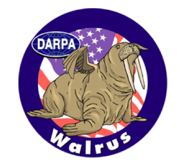
Several of them, though, share a common theme: humor. According to Michael Belfiore, the author ofThe Department of Mad Scientists, a logo with absurd imagery can be a way for DARPA scientists to acknowledge the audacity of their work. For many of the agency’s more out-there projects, the employees understand that “what they’re doing is nuts,” he said. “So that’s where the giggle factor comes in. The project is worthy of a giggle until it’s proven successful.” Hence the cartoonish missile-blocking hand in the logo of the Adaptive and Reflective Middleware Systems (ARMS) project, or the winged walrus that represents the Walrus Hybrid Ultra Large Aircraft.

Warfighter Project logo (DARPA)
According to Belfiore, the images chosen to represent certain projects may also be a way of helping workers cope with the ethical gray areas of their work.
“There’s a kind of gallows humor,” he said. Marcus agreed: Irreverence, or what he called “cuteness design,” can be a way to make grim things seem more palatable—like the brain drawn for the Extended Performance Warfighter Project, an attempt to use advanced genetics and neurological science to keep soldiers awake for weeks at a time.
The logos offer a “sort of window into DARPA’s thought process,” Belfiore added. “We get an idea of how they’re thinking.” For DARPA, it’s an opportunity that doesn’t come along often.
(Image via yurchello108/Shutterstock.com)