‘The Meatball’ vs. ‘The Worm’: How NASA Brands Space
Edwin Verin/Shutterstock.com


The space agency’s current symbol, a beloved signal of the agency’s storied past, wasn’t always so beloved.
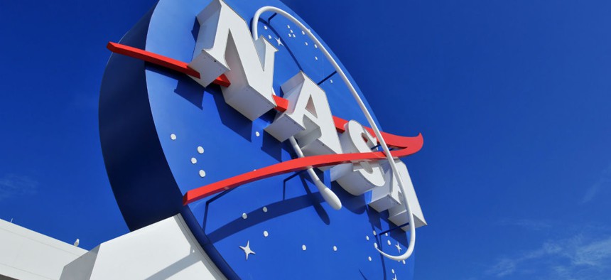
“It’s a design nightmare,” Greg Patt, a publishing contractor for NASA, sighed. He was talking about the logo that’s been the space agency’s official one since 1992: the blue sphere meant to suggest both Earth and other planets, its interior sprinkled with stars of white and and belted with the letters N-A-S-A, all of it connected by a swoopingly aeronautical chevron of red.
That logo, making news because of a Kickstarter campaign to create a hardcover version of the old, bebindered NASA Graphics Standards Manual, has come to be known as “the meatball.” That’s in part because of its connection to aeronautics—the optical approach nicknamed the “meatball landing system” has long helped Navy pilots to land on aircraft carriers—but it’s also because of its visual clunkiness. The meatball, originally created to suggest NASA’s ability to move the nation forward into new frontiers, now reeks of retrofuturism.
As such: The meatball has been, long before 1992, a subject of disagreement at the space agency. Its biggest competition? NASA’s other long-time logo, its now-unofficial one: the logotype, sleek and rounded of edge, that came to be known as “the worm.”
![]()
The worm came about in 1974. The Apollo program had just ended, and NASA, which had become almost as skilled at public relations as it had become at space exploration, was in need of an image revamp. The agency hired professional designers through the National Endowment for the Arts’s Federal Graphics Improvement Program, which sought to revamp government agencies’ visual branding. The designers’ charge? To come up with a logo that would speak to NASA’s future rather than its past. To get people excited, once again, about what a national space agency could achieve.
The design the studio Danne & Blackburn came up with—N-A-S-A spelled out in thick, red lettering, the edges of its As curved to call to mind the noses of rockets—was aggressively simple. And that was the point. The logo’s stark clarity suggested that, whatever NASA would do going forward, its history would speak for itself. In 1975, the agency officially adopted the logo whose peak-and-valley letters, reminiscent of limbless locomotion, came to be known as “the worm.”
The logo, Wired notes, “was a hard sell to an organization full of engineers who couldn’t care less about kerning and color swatches”—many of whom were, despite their agency’s PR needs, nostalgic for the NASA of the moon-walking years of the 1960s and early 1970s. Among designers, however, the worm quickly became beloved.
“If the meatball shows us what made NASA so thrilling—rockets, planets, and sexy-sounding hypersonic stuff,” the design critic Alice Rawsthorn notes in her essay “The Art Of The Seal,” “the worm simply suggests it, and does so with such skill that it’s become the design purists’ favorite.”
The next decades, however, found NASA, at least in the public imagination, limiting its ambitions. From the heady days of the “giant leap for mankind” came Skylab, and with it the shuttle program, and with it the Challenger disaster. By the early 1990s, NASA was in need of yet another public image overhaul. It started, yet again, with its logo.
This time, the rebranding came almost by accident. In 1992, the new NASA administrator Daniel Goldin paid a visit to Virginia’s Langley Research Center.Langley’s hangars had retained the pre-1975 NASA logo, its red, white, and blue insignia still painted onto their doors. Langley’s director, Paul Holloway, saw an opportunity.
As Goldin recalls to The New York Times, “He said, ‘If you want to really excite NASA employees about changes coming, why don’t you tell them we’re going to de-worm NASA and bring back the meatball?’”
Goldin asked a White House official traveling with him whether he could, indeed, just re-meatball the space agency. Yes, the reply came, he could. And so, in an address to Langley employees, Goldin announced the change: NASA was bringing back the meatball. (He added, confidently if optimistically: “The magic is back at NASA.”)
And: “They went wild,” Goldin says. “It was an incredible reaction.”
Which is why the NASA of today—the agency that sent a spaceship to the edges of the solar system, the agency that is making plans to put colonists on Mars—has a logo that celebrates the past. Nostalgia is a powerful thing.
(Image via Edwin Verin/ Shutterstock.com)