White House Tests Out Responsive Website
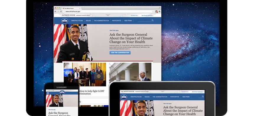
Whitehouse.gov


The White House plans to update other parts of its site gradually to better reflect users' behavior.
The White House's homepage has been updated so it looks the same on each device -- desktop and laptop computers as well as mobile phones and tablets.
It's part of the White House's new effort to create a responsive website, while gradually making small improvements in the site to make it "more accessible, user-friendly, and in line with modern best practices," according to a Thursday blog post.
The announcement came just a few weeks after the federal launch of analytics.usa.gov, a public dashboard that measures which federal websites users are visiting, and the devices they used to get there.
The WhiteHouse.gov revamp started with the homepage, but over the next few months the digital team plans to update popular sections including the White House blog and the White House press office site.
Often federal IT projects are approached as a "single, large-scale overhaul for a whole site," Ashleigh Axios, creative director for the Office of Digital Strategy, wrote in the post. "The downside of that model is that it requires foreseeing exactly what the end product needs to be at the outset, and as a result, often misses the mark."
Instead, the piece-meal strategy lets the White House team "prioritize improving parts of the site that will be most valuable to you," incorporating user feedback and rolling out new features quickly, she wrote.
These kinds of processes are known as "iterative design" and "agile development," Axios wrote -- an effort led by the General Services Administration's quick-fix tech team 18F, as well as the White House's in-house team, the U.S. Digital Service.
The responsive website announcement also follows the White House's recent commitment to using an HTTPS-only encryption protocol for its domain.